

Services
Year
2021
Client
Pulp wine ApS
awards

ServiceS
Year
2021
Client
Pulp wine ApS
A character-based identity that takes many forms
Pulp is a wine pop up store located in Copenhagen, Denmark.


Behind this store is an accomplished sommelier with great experience and a positive attitude. Having worked at Relæ, Noma and Vivino, Russell, the owner, now dreams of a space to host all about wine.


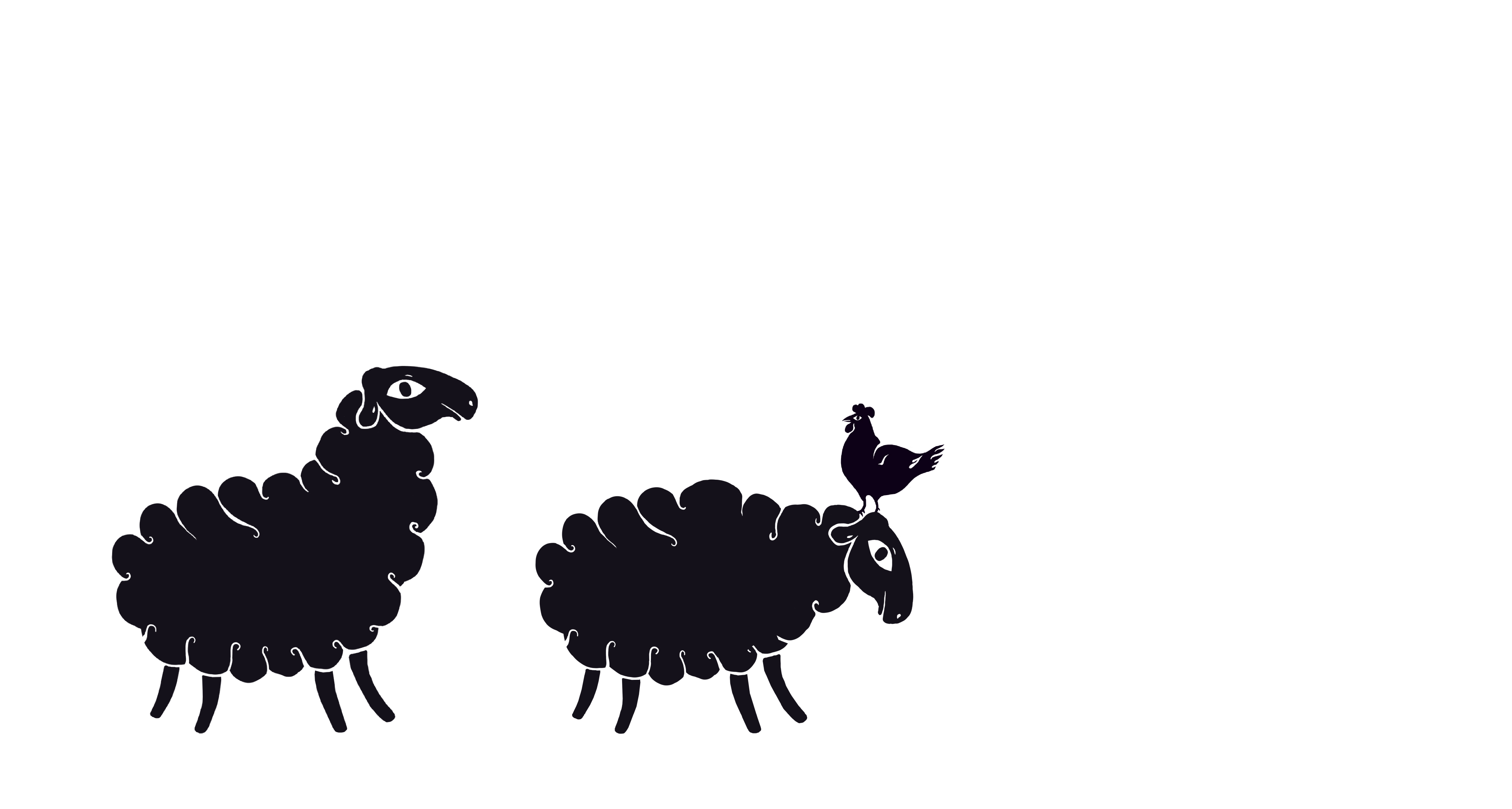
For this project we decided to follow the adventures of Pulp, a comic character with a warm and funny feel!
This character-based identity was inspired by the cartoons of the 20s and 30s and gave the tone for the whole image, fusing the distinct look with the typography of the logo.
Since Pulp is a soft, shapeless mass of material, we had all the freedom to squash and stretch him, achieving the distinct look that is so beloved in cartoon characters.

We kept the color palette simple, using the classic black and white, paired with earthy tones of craft paper, wood, and other raw material used as a background.
Trine Rask’s typeface Slik was used for all related applications, to further accentuate the breezy character of the branding.


see relevant work
see relevant work

MEET
let's

Jannik Weylandt
Managing Director - Partner
Rådhusstræde 5, 1.
DK-1466 Copenhagen K
Denmark
T +45 53852840
Managing Director - Partner
Rådhusstræde 5, 1.
DK-1466 Copenhagen K
Denmark
T +45 53852840
jannik@lazysnail.design
COLLABS:

Let’s get together!
Please send us an email and we will reach out to you. We can either arrange an online meeting or, even better, a face-to-face meetup.
Don't forget to include the most significant information about you & your project, such as: Full Name / Company Name & domain / email / Country & your message about your request.
Don't forget to include the most significant information about you & your project, such as: Full Name / Company Name & domain / email / Country & your message about your request.
services


about us


