

Client
Parva Consulting
location
Ireland, Italy, Luxembourg, Switzerland
Year
2025
Services
awards

client
Parva Consulting
location
Ireland, Italy, Luxembourg, Switzerland
year
2025
ServiceS
Parva is a small-but-agile management consultancy firm with a pan-European perspective. They came to us after 20 years in business with the need for a brand refresh—one that would reflect their deep financial expertise and experience, collaborative way of working, and commitment to excellence in a new yet authentic way.
How do you design a rebrand that feels like a natural evolution from one expression to the next? We worked closely with the Parva team to find a balance between where they’ve been and where they’re headed as a business. Together, we created a new visual identity, website, and communications that capture what Parva has always done best—serve as a guide for each and every client on their unique pathway to lasting transformation.


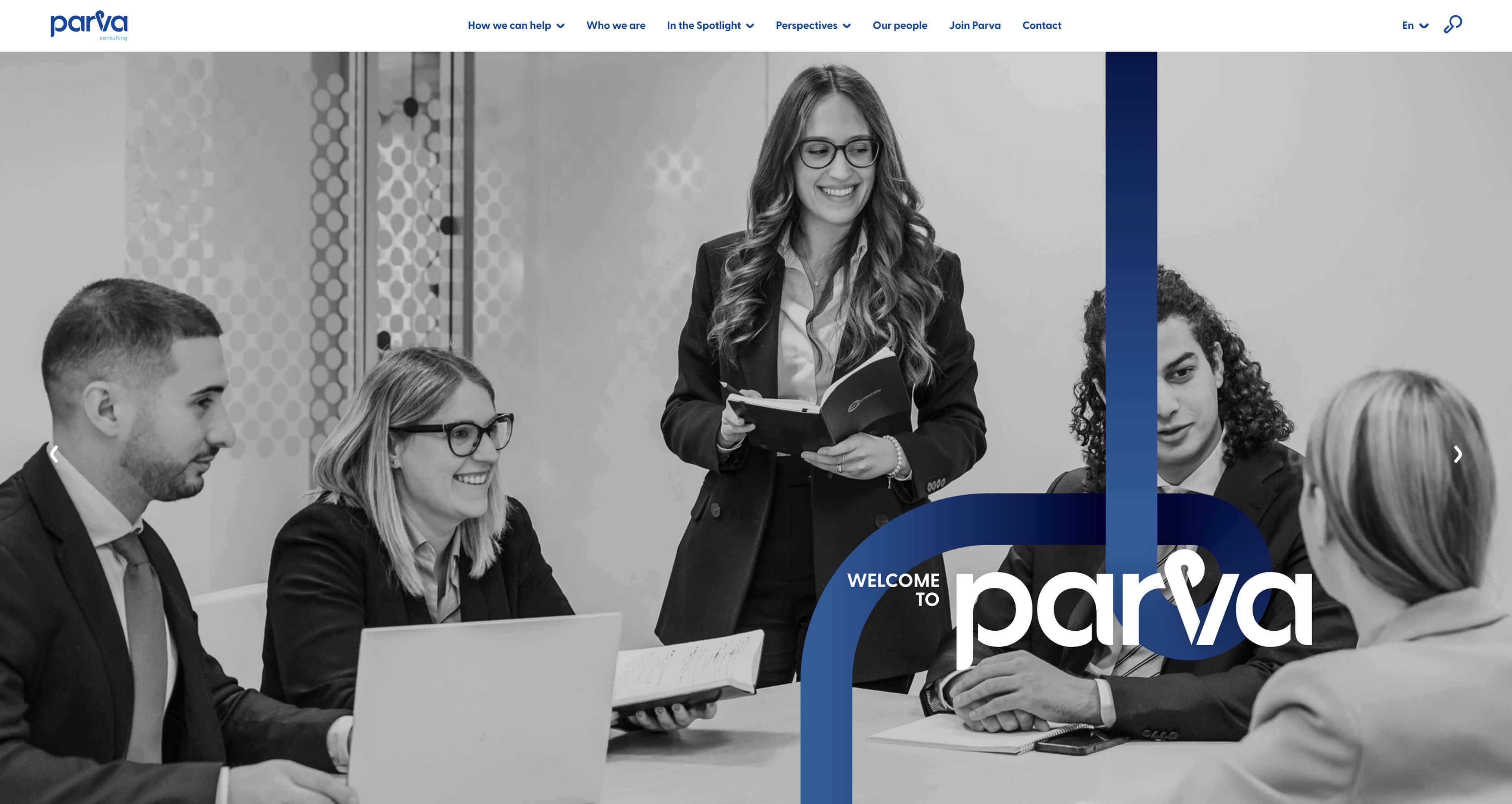
When we started exploring a new visual identity, there wasn’t much of an appetite to change the original logo. It had represented Parva for decades and was well loved by the team, but we saw an opportunity to experiment with some new designs that would not only give it a fresh, new look but better express who they are as a brand and the value they offer to their clients.
Parva’s name comes from the Latin phrase parva sed apta mihi, meaning “small but tailor-made for me.” Drawing on the meaning behind the name and the circles from the original logo, we found our path to a new visual identity—formed with small circles laid out in a continuous, flowing line. The Parva pathway set the direction for our design, symbolising navigation, clarity, and trusted guidance, and from it, we designed a new logo that moves the brand forward without forgetting where they started.
Visit Parva website HERE
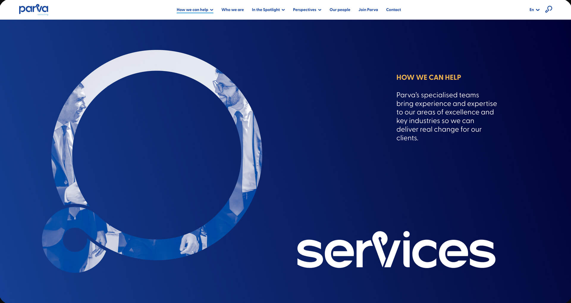


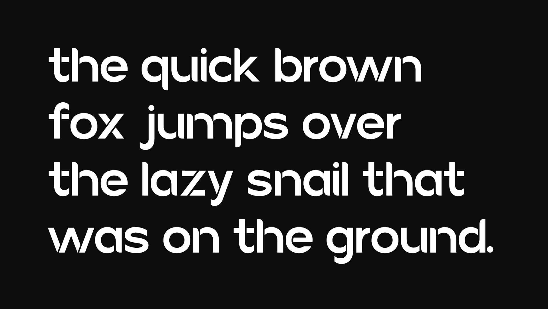
Continuing along the visual pathway we formed with that single, flowing line, we created a bespoke Parva typeface that speaks to direction, clarity, and forward movement. Each letter is shaped with that same sense of purpose, creating a visual system that feels intentional, open, and connected.
Flowing strokes and custom ligatures bring rhythm and cohesion, allowing words to move with ease across the page. With clean geometry and softened edges, the typeface strikes a balance between professionalism and approachability, reflecting Parva’s deep knowledge and human-first approach. The typeface doesn’t just carry the brand’s voice—it helps shape it, making every message feel both consistent and distinctly theirs.


TESTI
MONIALS
MONIALS
TESTIMONIALS
Julie Blanckaert
Parva Consulting
Marketing Manager / Finance, Milan, Italy
"Lazy snail was a fantastic partner in our rebranding journey."
Just like us, they have an international background and a small team of top-notch experts in different areas, which makes them complete. Acting as a true turnkey supplier, they accompanied us throughout the entire process with a personal touch. Every aspect of their work was of outstanding quality, and the design team in particular was truly stunning. They took the time to understand our needs, and our collaboration always felt like a genuine exchange.


see relevant work
see relevant work

MEET
let's

Jannik Weylandt
Managing Director - Partner
Rådhusstræde 5, 1.
DK-1466 Copenhagen K
Denmark
T +45 53852840
Managing Director - Partner
Rådhusstræde 5, 1.
DK-1466 Copenhagen K
Denmark
T +45 53852840
jannik@lazysnail.design
COLLABS:
Web development by Mayra Metaxa

Let’s get together!
Please send us an email and we will reach out to you. We can either arrange an online meeting or, even better, a face-to-face meetup.
Don't forget to include the most significant information about you & your project, such as: Full Name / Company Name & domain / email / Country & your message about your request.
Don't forget to include the most significant information about you & your project, such as: Full Name / Company Name & domain / email / Country & your message about your request.


